YAHOO FINANCE
Quote Page Phase 2


In Q2 2022, I collaborated with another designer to create incremental changes to our quote summary page including the header, chart experience, and the information architecture that have led to higher user engagement.
My focus was on the information architecture and header iteration for better navigation, and I organized a card sorting exercise with UXR to get a deeper understanding of users mind modals. Meanwhile, my design partner focused on charting experience updates and educational materials.
🕛 8 weeks, 2022
🤝 2 designers, Product manager, 1 researcher & multiple Engineers
🧩 Designer (Navigation and Research)
📱 Mobile App
Background
Yahoo Finance is known for its wealth of data on stocks and investment ideas. But, bringing all this data to a mobile experience in the most effective way can be a challenge.
As the Quote Summary Page is currently the primary touch point that users engage to evaluate investment opportunities, our product and design goal is pretty simple:
We hope to empower users to leverage our data utilities in the most effective and intuitive way no matter what type of investor they are.


Problem
Low user engagement
-
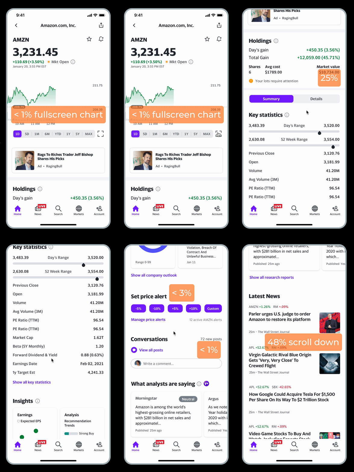
Roughly only 25% of users tap on the details tab for more information
-
The engagement of key statistics, conversation was low too.
-
Approximately only 48% of users scroll down to the news stream

Product
Hypothesis
1. There’s an overwhelming amount of content to digest in only two tabs resulting in low engagement across each module, and an imbalanced engagement between the two tabs.
2. The type of data and tools we offer may not be an obvious use of analysis for many users.
Product Goal
To improve our data utility so investors will find our tools valuable, informative, and intuitive to use, ultimately driving engagement and retention.
Success Metrics
-
Impressions and click-through-rates of QSP modules
-
Price alert creations per user
-
Number of QSP page views
Design Solutions
Improving recognition through a more intuitive navigation

Quantitative
Research
The current QSP 'Summary' and 'Details' tabs are not intuitive enough and this is likely reflected in their fall in taps on QSP. Increasing taps also likely leads to higher revenue.

Design Process
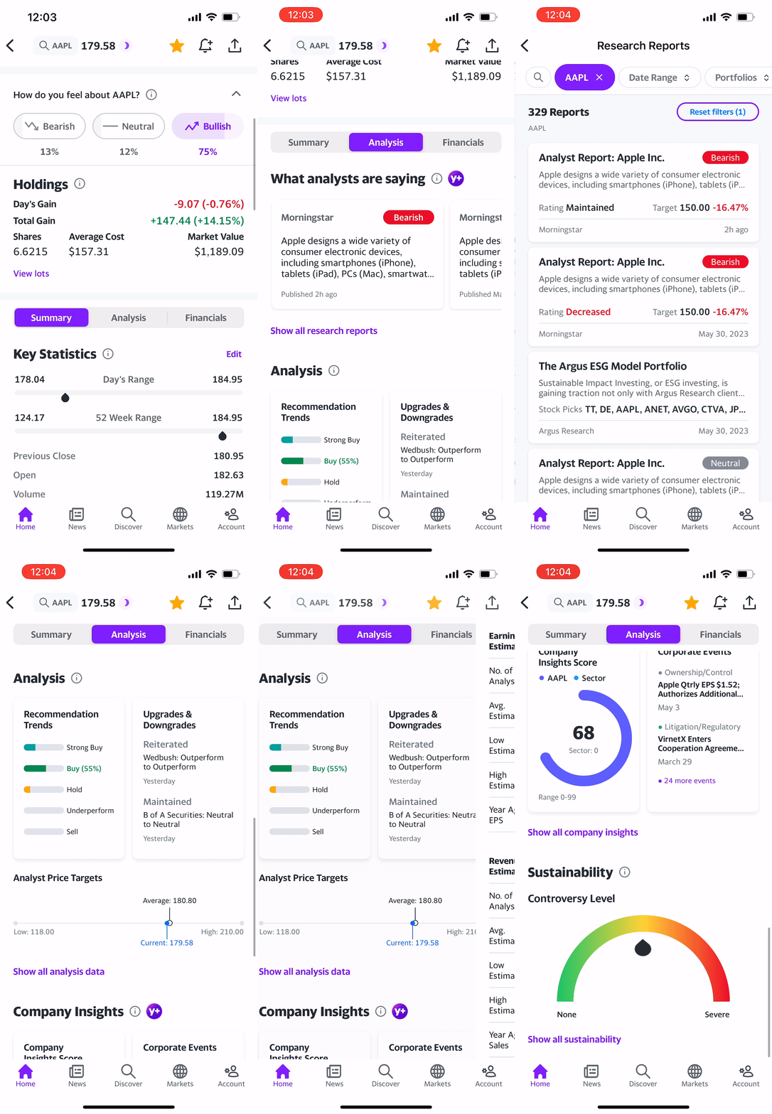
A few possible ideas for more intuitive naming conventions for the tabs on QSP in addition to alternative ways to navigate through the content.

Research:
Card Sorting


Prototype
Analysis Tab
Summary Tab


Financials Tab

Success

Next Step
There is of course several other ways we could optimize the value of this page even more for our users, but these incremental changes have proven to make a massive impact.
My key learning primarily resides in the methods used for user research. If time permits, it can be beneficial to adopt a more open-minded approach by involving users directly in product development.
Gaining insights into the reasons behind the decisions made by research participants can be incredibly helpful. This understanding can support designers in synthesizing information and making informed choices.
Up Next...
The concept design that provides a seamless user experience, connecting financial data with social media engagement
